WordPress girl is a Online Course Website that allows you to learn as well as teach courses online. This is a platform specially designed to promote courses designed by Women and encourage them to earn money through this free platform. The owner of this company herself launched a course of WordPress in order to teach Website Development from scratch.
Our client being an experienced WordPress developer, she has been developing some amazing websites for more than 5 years. While working on WordPress, she knew people face issues like over priced quotes, lack of skills, loss of time, etc. while creating websites for their own business. To solve this issue, she started teaching businesses how to develop their own websites with absolutely no prior skills.
Due to this pandemic, she thought of teaching people online so that she could reach more people in less time. Hence, she decided to do entire branding and designing for her online courses website.
How did the Client find Liftup?
While searching for an agency who could do the designing and branding for her courses website and also support her with further future alterations in the design, she found us in the lift of Google My Business local listings and reached out to us via Call.
Upon reaching out to us, she was convinced with the offering and quote and started with the project on priority.
What our client sought?
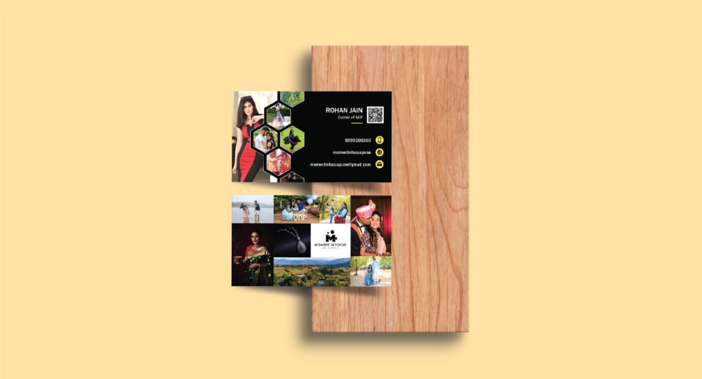
Our client wanted a logo that can be used on various platforms like Website, Business Cards, Brochures, Mobile App, etc. and also wanted it to be simple that was easy to recognize. After understanding and analyzing clients needs, our designer started with the design process.
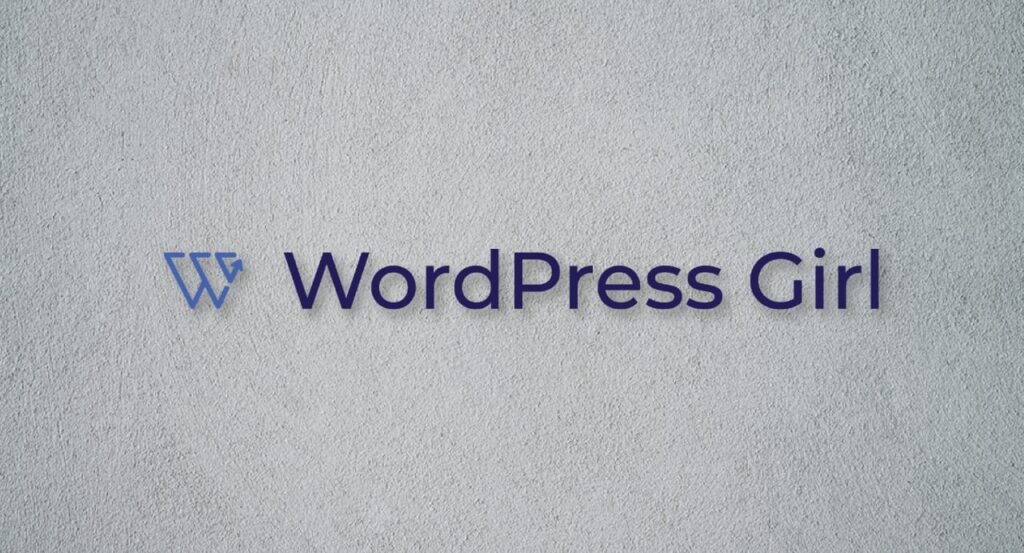
Final Logo
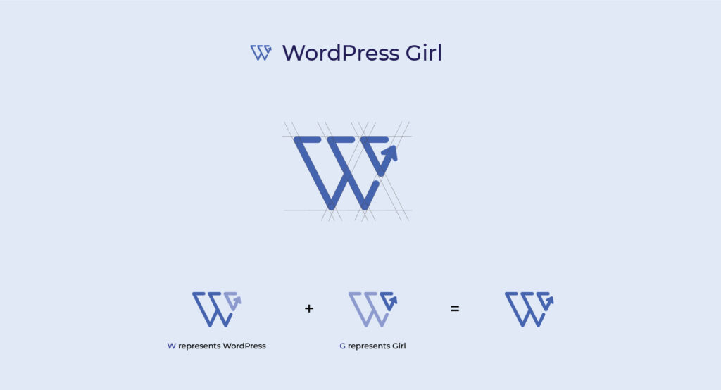
After the initial sketches and illustrations, we came up with one idea that suited perfectly with all the client requirements. This was the logo where we combined “W” of WordPress and “G” of Girl with an upward arrow that shows growth and success.
The Color chosen for this logo was Dark Blue as it represents Knowledge and Power while this was exactly what the client wanted to showcase into her website. The final Layout of the Logo is mentioned below:
Results
After spending 2 weeks and doing alterations as per client needs, we both were finally at a stage where we liked the logo and no more changes were required. The logo worked well in all sizes and currently its been used on her website and business cards.
Got an Amazing Idea in Mind for your next Project?