Branding · 29 Oct 2026 · 9 min read
Brand Style Guide: What to Include and How Long It Is
What a brand style guide contains, how long it should be, who needs a copy and when to update it, with steps to build one from what you already use.
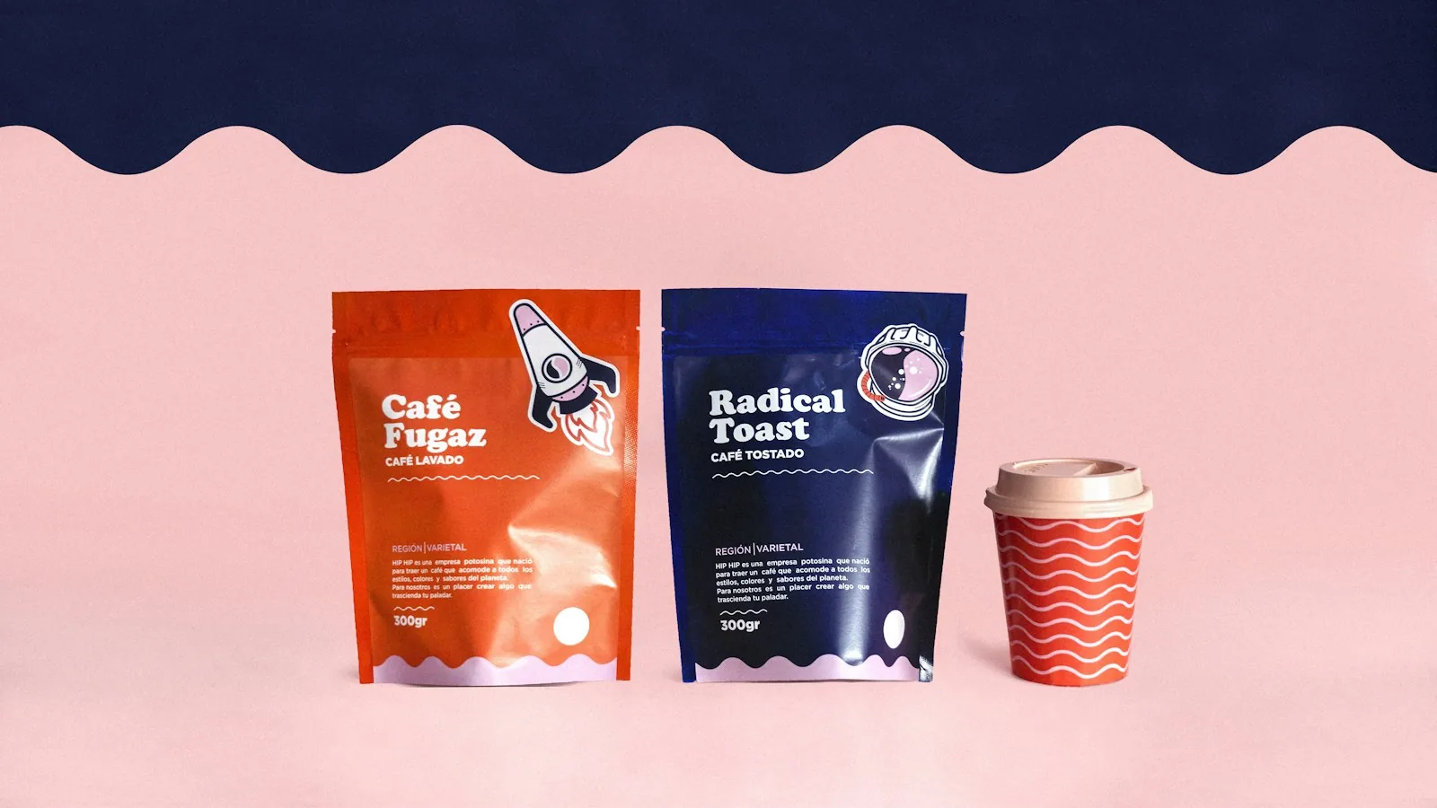
What a brand style guide is
A brand style guide is the short document that tells everyone who makes something for your business how it should look and sound. This guide covers what to put in it, how long it needs to be and who should hold a copy.
A brand style guide, also called brand guidelines, is a document that records how a business uses its logo, colours, fonts, images and tone of voice. It should show the approved versions, give exact colour codes and font names, include examples of correct and incorrect use, and name who approves exceptions. A small business can keep it to a few pages.
A brand style guide is a reference document that records the decisions behind how your business looks and sounds. Most people call it brand guidelines, and a brand identity style guide is the same thing with the focus on the visual side. It does not design anything new. It writes down what has already been decided, so that nobody has to guess.
The need shows up in small questions, such as which logo file goes on a dark background or whether the green on the signboard is the same green as on the website. Without a guide each answer comes from memory, and over time the business starts to look like several different businesses.
The guide sits inside a larger idea. The logo, the identity and the branding are different layers, and the difference is explained in brand identity vs logo vs branding. The style guide is where the identity layer is written down in a form people can use.
What a brand style guide should include
Include what a person needs to decide without phoning you. These eight sections cover most small businesses.
Brand basics
One short page: what the business does, who it is for and how you want to be seen. Add the exact way the name is written, including capital letters and spacing, and the tagline if you use one. This page stops people making something that looks right but says the wrong thing.
Logo
Show the primary logo and every approved variation, such as a horizontal version, a stacked version and an icon-only mark. Give each a file name and say where it is used. Then set the rules: the clear space around the logo, the smallest size at which it stays readable, and which version goes on light, dark and photographic backgrounds. Add a few examples of misuse, such as stretching, recolouring or adding shadows. A wrong version shown next to the right one teaches faster than a paragraph of rules.
Colour
List each colour with a name, a HEX code for screens, RGB values, CMYK values for print and a job: background, headline, button or highlight. Say roughly how much of each to use, so the main colour is not swamped by the accent. Check that text has enough contrast against its background. The common web accessibility standard, WCAG level AA, asks for a contrast ratio of at least 4.5 to 1 for normal-sized text. Printed colour changes with paper and printer, so keep a printed swatch and ask the printer to match it.
Typography
Name the typefaces for headings and body text, the weights you use, and the sizes and line spacing for a few levels such as headline, subheading and body. Add a fallback font for places where yours is unavailable, such as email or shared documents. Note where each font comes from and whether it is free or needs a paid licence, because a designer or printer will have to install the same one.
Imagery and graphics
Describe the photographs you use, for example real products in natural light, and the kind you avoid. Cover cropping, any colour treatment and the style of icons and illustrations. A handful of approved example images says more than adjectives do.
Voice and tone
Pick a small number of traits and show them in sentences. A line such as "we state the price and delivery terms plainly" is more useful next to an example of a sentence you would never send. Cover how you address customers, which spelling you use, how you sign off emails and messages, and which languages you write in. This is the section most often skipped, and it is the one that social media and sales staff need most.
Layouts and applications
Show the rules at work on things you actually produce: the visiting card, invoice, email signature, social media posts, packaging labels, signboard and website buttons. Real examples let people copy a layout that works instead of interpreting rules.
Contacts and approvals
Name the person who owns the guide, where the master files are kept and who approves exceptions. Put the version number and date on the first page.
How long a brand style guide should be
As short as it can be while still answering the questions people actually ask you. A guide nobody finishes does not get followed. A new business with one location can cover the basics in a few pages. A business with several branches, resellers or many people creating content needs more detail, mostly in the logo, imagery and application sections.
| Situation | Include first | Can wait |
|---|---|---|
| A new business run by one or two people | Logo versions, colour codes, fonts, how the name is written | Imagery rules, layout examples |
| A business with staff and a website | All of the above, plus voice and a few templates | Detailed packaging or signage rules |
| Several branches, resellers or franchise partners | Full logo rules, an approval process, ready-made templates | Very little, because inconsistency costs most here |
A practical test: give the draft to someone who has never met you and ask them to make a social media post and a visiting card. Each time they have to ask you something, add a line to the guide.
How to build one from what you already use
You do not need a new identity to write a guide. Most small businesses already use a logo, colours and fonts, even if nobody wrote them down. Work in this order.
- Collect the master logo files and decide which versions are approved. Label the rest as old.
- Pull the exact colour codes from the logo file and the website. If the signboard, website and invoice use three slightly different blues, choose one and write it down.
- Find out which fonts appear on the website, the invoice and social posts, and settle on one set.
- Write the voice section from messages you were happy to send. Copy two real examples rather than listing adjectives.
- Add examples: the logo on light and dark backgrounds, one social post and one invoice.
- Test the draft with someone outside the business, as described above.
- Save the guide as a PDF, with a folder holding the logo files and templates, and note the date.
If the colours and fonts in use differ so much that no single set can be extracted, the identity probably needs work before a guide is useful. The signs are listed in five signs your business needs a brand identity refresh.
Who should have a copy of the brand guidelines
Anyone who produces something with your name on it. That includes staff who send documents or post online, and outside suppliers such as the designer, printer, signboard maker, website developer and photographer. Resellers or partners who use your logo should hold it too.
Give each group what it needs. Printers need CMYK values and print-ready logo files. A web developer needs HEX codes, font details and the logo as an SVG file. Staff need the PDF and the templates. Send a link to the latest version rather than attaching copies, so that an old file is not still circulating a year later.
How often to update brand guidelines
Update the guide when something it describes changes, and read it through once a year so that small drift is caught. Typical triggers are a new logo version, a product line that needs its own look, a new channel such as a marketplace store or a video series, and a supplier who keeps asking the same question.
Keep a version number and date on the first page, and keep the previous version in an archive folder. When a change touches the name, logo or colours across the whole business, treat it as a rebrand rather than an update. The rebranding checklist lists what to change and what to keep.
Common mistakes
- Describing the brand you wish you had instead of the one customers see.
- Leaving out the actual files, so people have rules but nothing to apply them to.
- Writing so many rules that nobody remembers them. Logo, colour, font and tone matter most.
- Naming no owner, so the guide falls out of date and nobody notices.
- Choosing a font that needs a paid licence without deciding who will buy it.
If you want help turning an existing logo and colours into a working guide, or designing the identity first, the branding service page explains the logo and brand identity work Liftup does.
Questions and answers
What is a brand style guide?
A brand style guide is a document that records how a business uses its logo, colours, fonts, images and tone of voice. It is also called brand guidelines. Its purpose is consistency, so that anyone producing material for the business can follow the same rules without asking.
What should a brand style guide include?
At minimum, the approved logo versions with spacing and size rules, the colour palette with HEX, RGB and CMYK codes, the fonts, and a short description of the tone of voice. Add imagery rules, examples on real materials and the name of the person who approves exceptions.
How long should a brand style guide be?
Only as long as it needs to be to answer the questions people ask. A small business can often cover the essentials in a few pages. Longer guides suit businesses with several branches, resellers or many people creating content.
Who should have a copy of the brand guidelines?
Staff who create documents or posts, and outside suppliers such as designers, printers, signboard makers and web developers. Share a link to the current version and a folder of logo and template files rather than sending attachments that go out of date.
How often should brand guidelines be updated?
Update them when something they describe changes, such as a new logo version, a new product line or a new channel. Reading through the guide once a year is a sensible habit. Put a version and date on it so people know which copy is current.
Can I write a brand style guide myself?
Yes, if you already use a logo, colours and fonts. Collect the master files, write down the exact colour codes and font names, add examples and test the draft on someone outside the business. If those basics are inconsistent, fix the identity first.
Tell us what you are building.
A short call, a written plan and a fixed quote. No obligation.